

CASE STUDY
Aboriginal Cultural Centre
Putting emotion back on the agenda for government comms.
BRAND STRATEGY / STAKEHOLDER MAPPING / KEY MESSAGING
Government comms has a tendency to be stuffy, emotionless, and overly formal. But the Aboriginal Cultural Centre had a mandate to do things differently.
*Images are stills from the ACC video as published on their website.
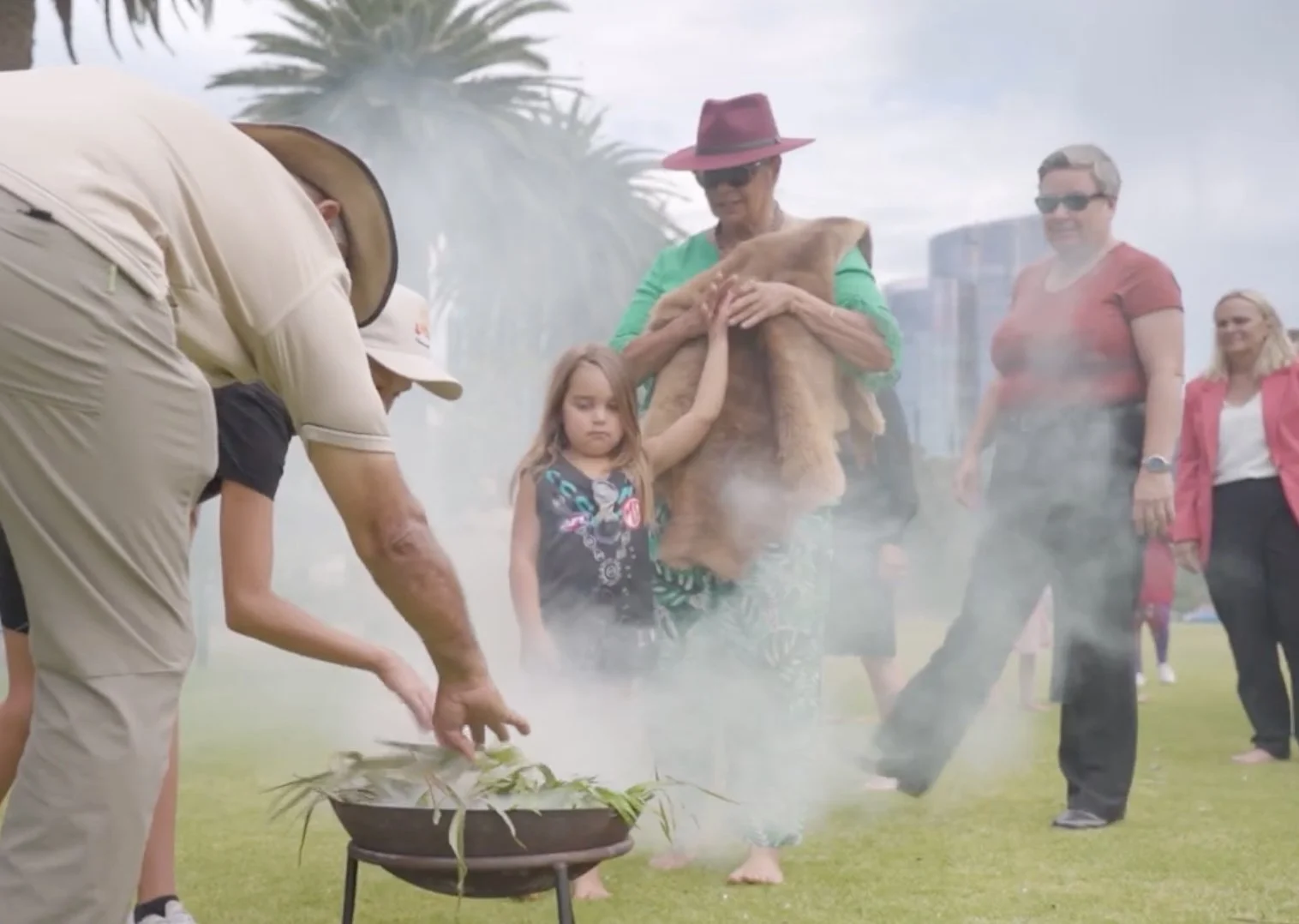
The Aboriginal Cultural Centre is approved for construction on the banks of the Derbarl Yerrigan. As part of Perth's expanding cultural precinct, this is a place for Aboriginal and Torres Strait Islander people to celebrate and share their culture on the global stage, while expressing truth telling as they choose.
The brand work for the ACC was awarded to lead agency, Nani Creative, who brought on Clare Reid and Caitlin Scott as supporting strategists and writers.
Through deep, intensive consultation and collaboration, we learned that the key messages needed to speak to the Aboriginal ‘doers’ within their communities.
These are the people who are highly motivated to make changes and back initiatives that benefit their communities.
We conducted six one-on-one interviews with the Aboriginal steer co members of the project to produce key messages under the pillars of truth, inclusion/being heard, endorsement, country, cultural celebration, and community and family.


The result was long-form copy that reflected the audience’s motivations and worldviews—a set of key messages that matched the brand strategy and actually spoke to the audience rather than at them.
The craft choices that made the words work:
A mix of first person plural and second person narrative mode
With this choice, we made the brand part of the community, showing the collective approach to the project, and amplifying the sentiment of the Aboriginal steer co members.
Short sentence structures that act as headlines
i.e. “The young ones can listen. The world can listen.” The utility of these messages was essential so we needed sections that could be drawn out as standalone copy.
Rhythm and pace
By punctuating the copy with shorter sentence structures in amongst longer ones, it forced the readers to slow down, absorb, and pay attention. Rather than writing in a habitual, repetitive rhythm that gives the readers a chance to rest into the copy, we called them to a place of reflective consideration.
Active sentence structures
Passive voice was avoided in these messages. This choice allowed us to develop a sense of presence and urgency without sacrificing the thoughtful pace.
Prioritising certain brand tone pillars over others
The ACC brand tone was designed to serve senior government stakeholders as the secondary audience; therefore, we were choosy when it came to writing these messages for Aboriginal doers. We elevated the emotive and nurturing pillars to create a sense of warmth and compassion while also bringing in the clarity of determination that these doers resonate with. A mirror to how they see themselves.
Credits:
Creative agency: Nani Creative
Brand design: Kevin Wilson and Leigh Wood
Creative direction: Kevin Wilson
Brand strategy: Clare Reid and Kevin Wilson
Key messaging: Clare Reid and Caitlin Scott